Remaining current with the latest tools and advancements is crucial in the dynamic field of business intelligence, offering organizations a vital competitive advantage. Microsoft Power BI, a leader platform for data visualization and analytics, consistently impresses with its frequent updates, providing improved features and capacities that empower businesses to fully leverage their data’s potential. In this article, we’ll present you captivating updates Microsoft Power BI has unveiled in August 2023.
Reporting
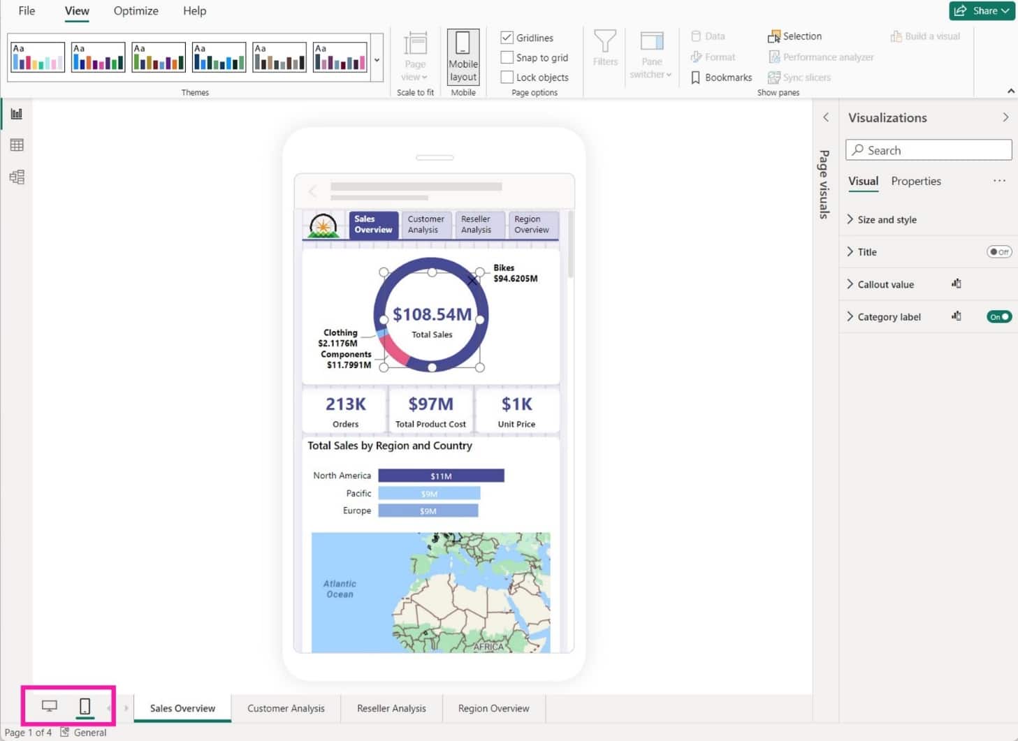
New layout switcher
Introducing convenient new buttons for seamless toggling between web and mobile layouts during report development. These switcher buttons are located at the bottom of the screen, right next to the page navigator, ensuring effortless navigation and design flexibility.
New bubble range scaling setting
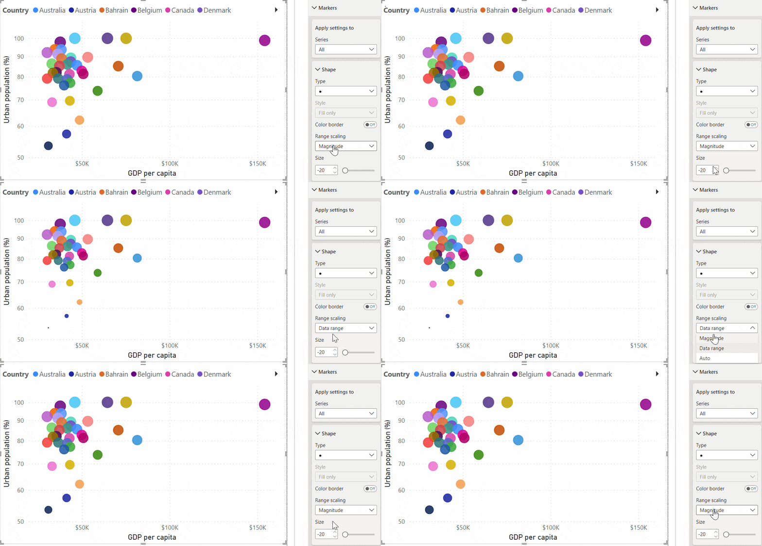
Introducing the innovative bubble range scaling setting for scatter charts and map visuals! This feature empowers report creators with enhanced control over bubble (marker) sizes, providing a more accurate or distinctive representation according to preference.
The magnitude option aligns bubble areas closely with data proportions, while the data-range option maps bubble size limits to data minimum and maximum. The auto option, default for new reports, selects the optimal setting based on data characteristics. For further details, consult our documentation.
Adjust this setting via the formatting panel: Markers > Shape > Range scaling for scatter charts or Bubbles > Size > Range scaling for maps.
For reports authored in prior Power BI versions, these settings default to (Deprecated) for scatter charts (with distinct handling for negative values) and Data range for map charts.
On-Object Interaction
Resizing and positioning to the on-object menus
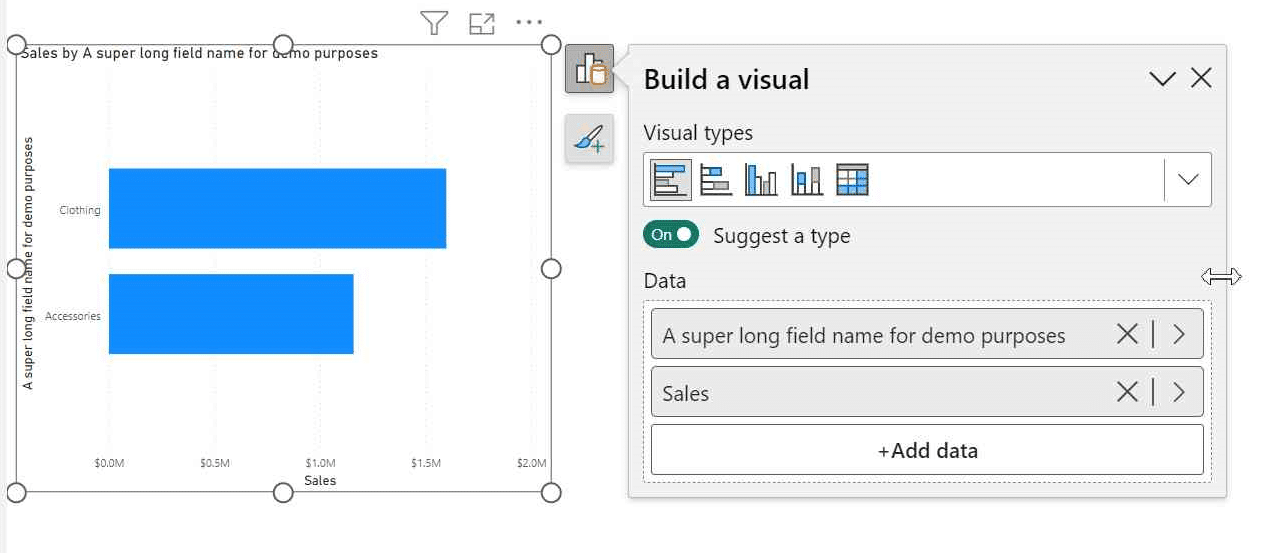
The ability to horizontally resize the on-object menus has been introduced, particularly beneficial when working with long field names. Furthermore, the positioning of the on-object menus has been enhanced to optimize the utilization of the canvas space. In the past, when a visual was positioned near the bottom of the canvas, the on-object menu was extremely small and necessitated scrolling to access and utilize the field wells. With the current update, the on-object menu shifts upward and extends into the canvas, ensuring the field wells are visible without requiring any scrolling.
On-object format sub-selections now supported in spotlight and focus mode
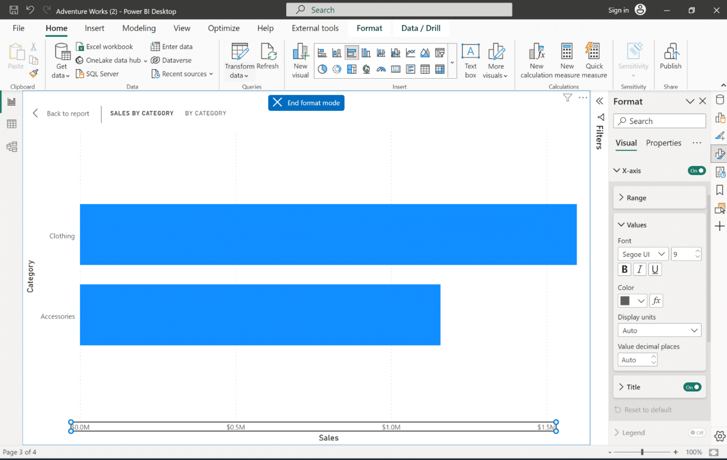
When spotlighting a visual or expanding the visual in focus mode, the utilization of on-object formatting allows for subselecting and formatting styles.
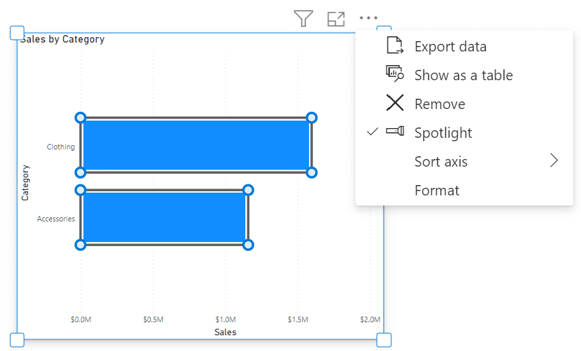
In focus mode, recognizing the entry into format mode can be challenging with only the subtle border. To tackle this, a button has been incorporated into the header. This button effectively indicates when you’re in format mode and provides a clear way to exit format mode while remaining in focus mode.
Modeling
Updates to ORDERBY function
In case of data containing blanks, you have the option to specify their ordering by including ‘BLANKS LAST’ or ‘BLANKS FIRST’. For instance, consider this expression as a valid example:
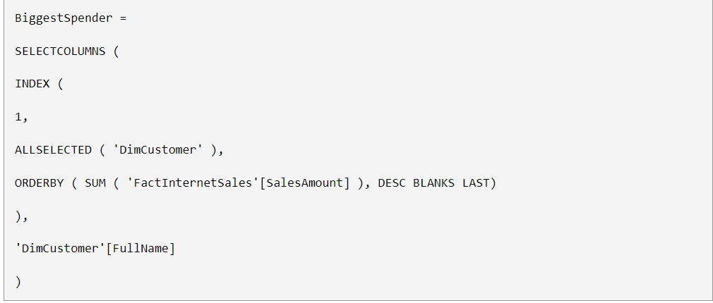
Specifying the treatment of blanks is optional and can be combined with specifying the order direction (DESC/ASC). The acceptable values are as follows:
- BLANKS DEFAULT. This is the default setting. For numerical values, blank values are ordered between zero and negative values. For strings, blank values are positioned before all strings, including empty ones.
- BLANKS FIRST. Regardless of the sorting order (ascending or descending), blanks are consistently positioned at the beginning.
- BLANKS LAST. Regardless of the sorting order (ascending or descending), blanks are consistently positioned at the end.
Data Connectivity
The enhanced data connectivity and discovery journey within Dataflow, Dataflow Gen2, and Datamart has been introduced. Currently, users invest considerable time in locating suitable data, connection details, and credentials. With the novel Get Data experience, the process became simplified by enabling seamless browsing of various Fabric artifacts via the OneLake data hub. This upgraded encounter is designed to accelerate the process and swiftly lead you to the desired data, streamlining the path to your target information.
Lakehouses (Connector Update)
Incorporated in this update are notable performance enhancements to the Lakehouses connector. To avail these improvements, make sure to update to the August version of Power BI Desktop and Gateway!
Service
XMLA Write support for Direct Lake datasets
Direct Lake datasets now fully support XMLA-Write operations. This exciting update empowers you to leverage your preferred BI Pro tools and scripts for seamless creation and management of Direct Lake datasets.
Whether you favor SQL Server Management Studio (SSMS), Tabular Editor, DAX Studio, or any other tool, you can effortlessly connect to your Direct Lake datasets through XMLA endpoints. This facilitates a range of operations such as deploying, customizing, merging, scripting, debugging, and testing. With the ability to integrate tools like Azure DevOps or GitHub, you can implement source control, versioning, and continuous integration for your data models. Automation becomes effortless using PowerShell or REST APIs for tasks like dataset refreshing or applying changes to Direct Lake datasets. XMLA Write introduces an immensely potent capability, serving as the cornerstone of data modeling efficiency and productivity.
Automatic replica synchronization for Dataset Scale-Out (preview)
Dataset Scale-Out configuration APIs are now complete, along with the finalization of the replica synchronization feature. Notably, you are no longer required to enable Scale-Out at the workspace level through a cumbersome XMLA request; the deprecated XMLA command will no longer be functional. With the latest updates, enabling Scale-Out is now streamlined and granular, operating on a dataset-by-dataset basis through the Power BI REST API for datasets. Additionally, manual synchronization of read replicas is no longer necessary, as our automatic replica synchronization feature is now enabled by default. However, we offer the flexibility to disable automatic synchronization if desired. This empowers you to manually synchronize the read/write and read replicas of a dataset, facilitating controlled refresh isolation when needed.
Mobile
Choosing your start-up content
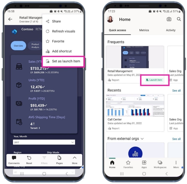
The Power BI mobile app now grants users the freedom to choose the specific item they wish to automatically open upon launching the app. This convenience is especially beneficial for users who frequently access a particular item and prefer to avoid navigating from the app’s home page each time.
Configuring a launch item is a simple process: open the desired item within the app, such as a report page, dashboard, scorecard, or entire app. While viewing the item, access the More options (…) menu from the header and select “Set as launch item.” This marks the chosen item as the designated launch item. Notably, only one item can be selected as the launch item at a time.
For administrators, mobile device management (MDM) tools offer the capability to remotely configure a launch item for a designated group of users, streamlining the app experience, particularly for front-line workers and other user segments.
Developers
Published AppSource visuals
Up until recently, customer leads were primarily generated from customers downloading your visuals from AppSource.com. However, a significant change has occurred. Now, you have the opportunity to tap into an even broader pool of leads through Power BI – encompassing both the desktop and web embed AppSource versions.
Accessing these expanded leads is straightforward. Navigate to the Referrals workspace within Partner Center. This space allows you to view all the leads originating from Power BI, in addition to those from AppSource.com. Furthermore, if your CRM system is integrated, these leads will also be visible there.
Leveraging these newfound leads from Power BI opens doors to potentially engaging more customers, ultimately contributing to the growth of your business. It’s advisable to regularly check your Referrals workspace and CRM to ensure you remain informed about your leads’ status.
Publish a PBIP directly from Power BI Desktop
You now have the capability to directly publish your Power BI Project (PBIP) files from Power BI Desktop. This eliminates the requirement to save them as PBIX files before using the Publish feature.
Here’s how:
- Open your Power BI Project.
- Choose: File > Publish > Publish to Power BI or click Publish on the Home ribbon.
- Select the target workspace.
- That’s it! Your PBIP dataset and report (or just the report in case of Live Connect) will be published to the chosen workspace.
Visualizations
New visuals in AppSource
The following are new visuals for this update:
Editor’s pick of the quarter
- accoPLANNING Enterprise – Planning Power BI Writeback
- Sunburst Chart by Powerviz
- Spider Chart for Power BI by VisioChart
- Advanced Trellis / Small Multiples – xViz
- Drill Down Combo PRO
Zebra BI Cards - Shielded HTML Viewer
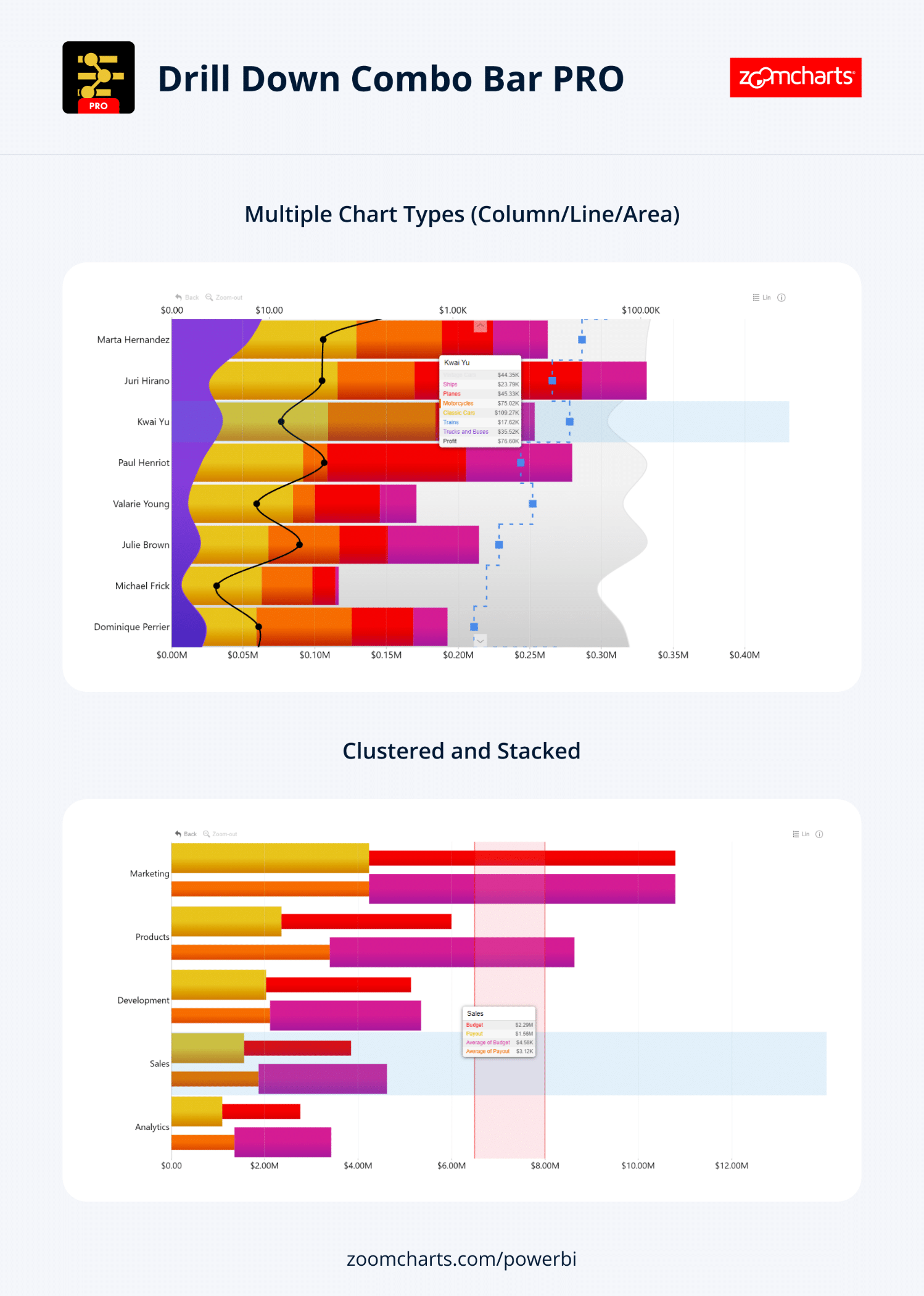
Drill Down Combo Bar PRO by ZoomCharts
Drill Down Combo Bar PRO by ZoomCharts empowers creators with an expansive array of customization choices, enabling the construction of an array of visualizations, from conventional bar charts to sophisticated box and whisker plots. This visual tool boasts robust cross-chart filtering capabilities alongside instinctive on-chart interactions.
Key Features:
- Diverse Chart Types: Choose from column, line, and area charts to best suit your data representation needs.
- Complete Customization: Tailor X and Y axes, legend, outline, and fill settings to achieve your desired visual appearance.
- Stacking and Clustering Options: Opt for normal, 100% proportional, or zero-based stacking to effectively portray your data.
- Threshold Control: Establish up to four static or dynamic thresholds for enhanced data interpretation.
- Touch Device Compatibility: Experience seamless functionality whether using a mouse or a touch input device.
Popular use cases:
- Sales and Marketing: Visualize sales strategies, sales outcomes, and marketing metrics on a campaign-by-campaign basis.
- Human Resources: Gain insights into hiring trends, overtime patterns, and departmental efficiency ratios.
- Accounting and Finance: Illustrate financial performance based on variables such as region, office, or business line.
- Manufacturing: Analyze production efficiencies and quality metrics across different product lines.
ZoomCharts Drill Down Visuals boast a reputation for their interactive drilldown capabilities, seamless animations, and comprehensive customization options. These visuals are also designed to cater to mobile devices, supporting a range of features including interactions, selections, tooltips (both custom and native), filtering, bookmarks, and context menus.
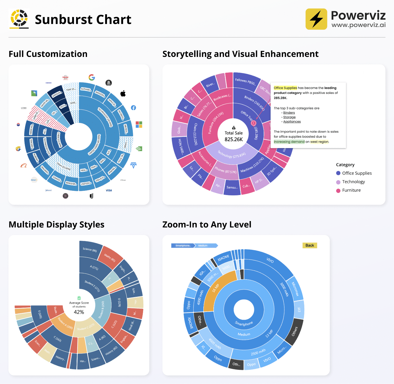
Sunburst Chart by Powerviz
A robust visualization crafted to present hierarchical data in an intuitive and user-friendly manner has been introduced. Through its unique concentric circle design, this chart empowers you to effortlessly showcase part-to-whole relationships within your data, extracting valuable insights.
Key Highlights:
- Customization at Its Best: Take control of display styles, labels, center circle design, fill patterns, and dynamic imagery.
- Vibrant Color Choices: Access over 30 color palettes, including options optimized for color-blind individuals.
- Effective Ranking: Easily filter and highlight top or bottom categories at each level, while presenting the remaining ones as “Others”.
- Smart Conditional Formatting: Instantly spot outliers by setting rules based on values or categories.
- Interactive Abilities: Enjoy a dynamic experience with zoom, drill-down, and cross-filtering features for in-depth exploration.
- And Much More: Benefit from additional functionalities like annotations, grid view, show conditions, and robust accessibility support.
With the Sunburst Chart by Powerviz, harnessing complex hierarchical data has never been more engaging and insightful.
Business Uses:
- Sales and Marketing: Analyze market share and segment customers effectively.
- Finance: Allocate departmental budgets and visualize expenditure distribution.
- Operations: Enhance supply chain management, uncover manufacturing process inefficiencies.
- Education: Design comprehensive course structures and curricula.
- Human Resources: Map out organizational structures and understand employee demographics.
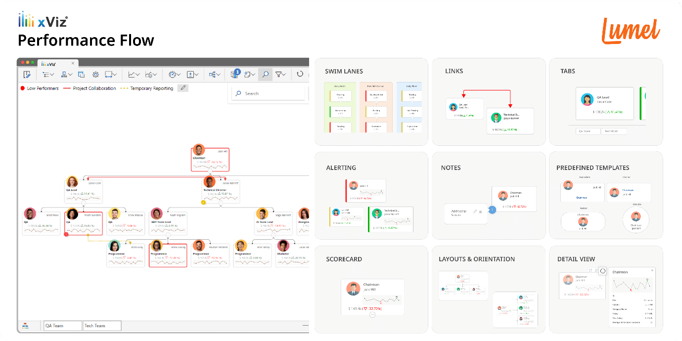
xViz Performance Flow by Lumel
Introducing xViz Performance Flow by Lumel – a comprehensive business flow monitoring visual that seamlessly integrates an interactive KPI tree visualization. Designed for organizational performance management, it provides valuable insights into People, Places, Processes, and Entities. This dynamic visual encompasses Performance Indicators, Trendlines, and Advanced Alerting features, effectively tracking Goals, Metrics, and their Variance.
The versatility of Performance Flow across a spectrum of applications:
- Organization Performance: Reveal HR/Employee insights via an interactive Org Tree Chart, presenting performance attributes and trends.
- Process Flow: Visualize multi-stage business flows through Swim lanes, complete with connector lines, icons, KPI metrics, and trends.
- Financial Performance: Analyze Cost Center efficiency with Scorecards or KPI Trees.
- Sales Performance: Delve into Sales insights at regional, departmental, and salesperson levels, utilizing Decomposition Trees.
This visual boasts powerful analytical and interactive capabilities, including:
- Intuitive hierarchy navigation with search, zoom, and subtree analysis.
- Streamlined process visualization with Swim Lanes similar to Visio.
- Uncovering concealed connections through Links.
- Data-driven conditional formatting rules.
- Custom Tabs for a personalized user experience.
