In the ever-evolving world of business intelligence, staying up-to-date with the latest tools and advancements is crucial for organizations aiming to gain a competitive edge. Microsoft Power BI, a leading data visualization and analytics platform, continues to impress with its regular updates, delivering enhanced features and capabilities to help businesses harness the full potential of their data. In this blog post, we’ll dive into the exciting July 2023 updates introduced by Microsoft Power BI.
Reporting
Smoothed and Leader lines
Report creators can now create smoother line and area charts, providing a more polished look to their visualizations. To access this setting, go to Lines > Shape > Line Type.
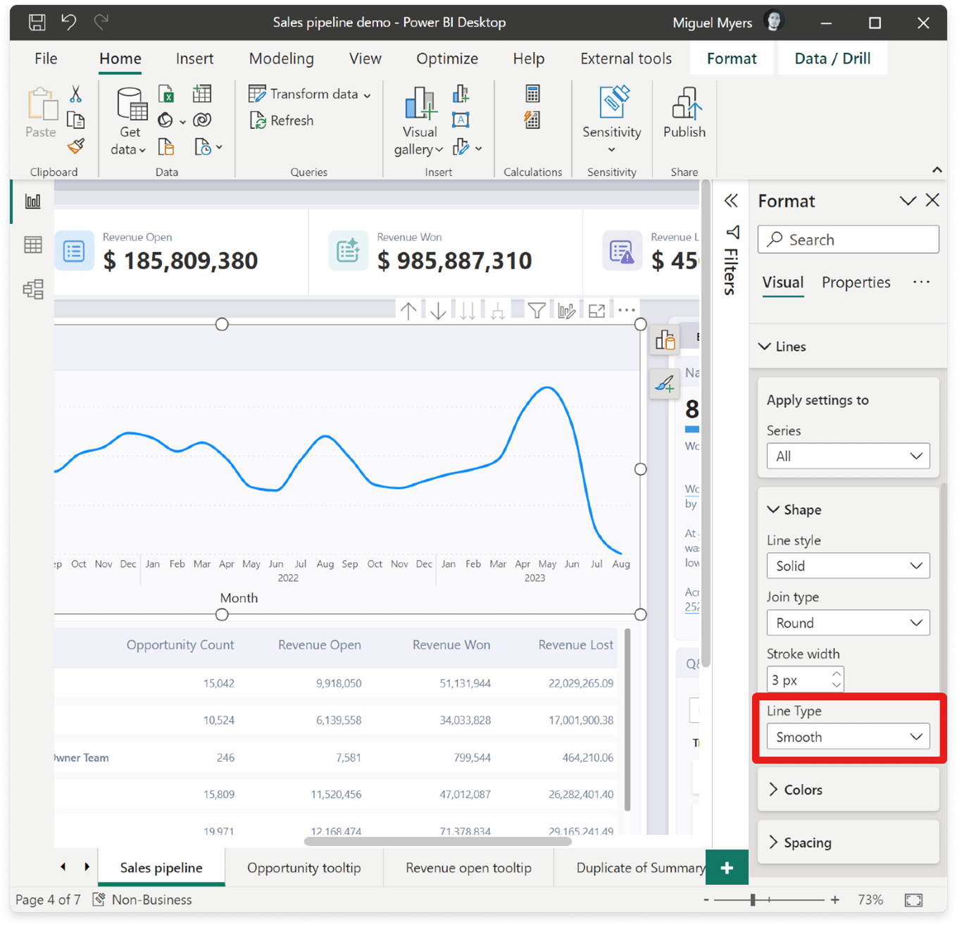
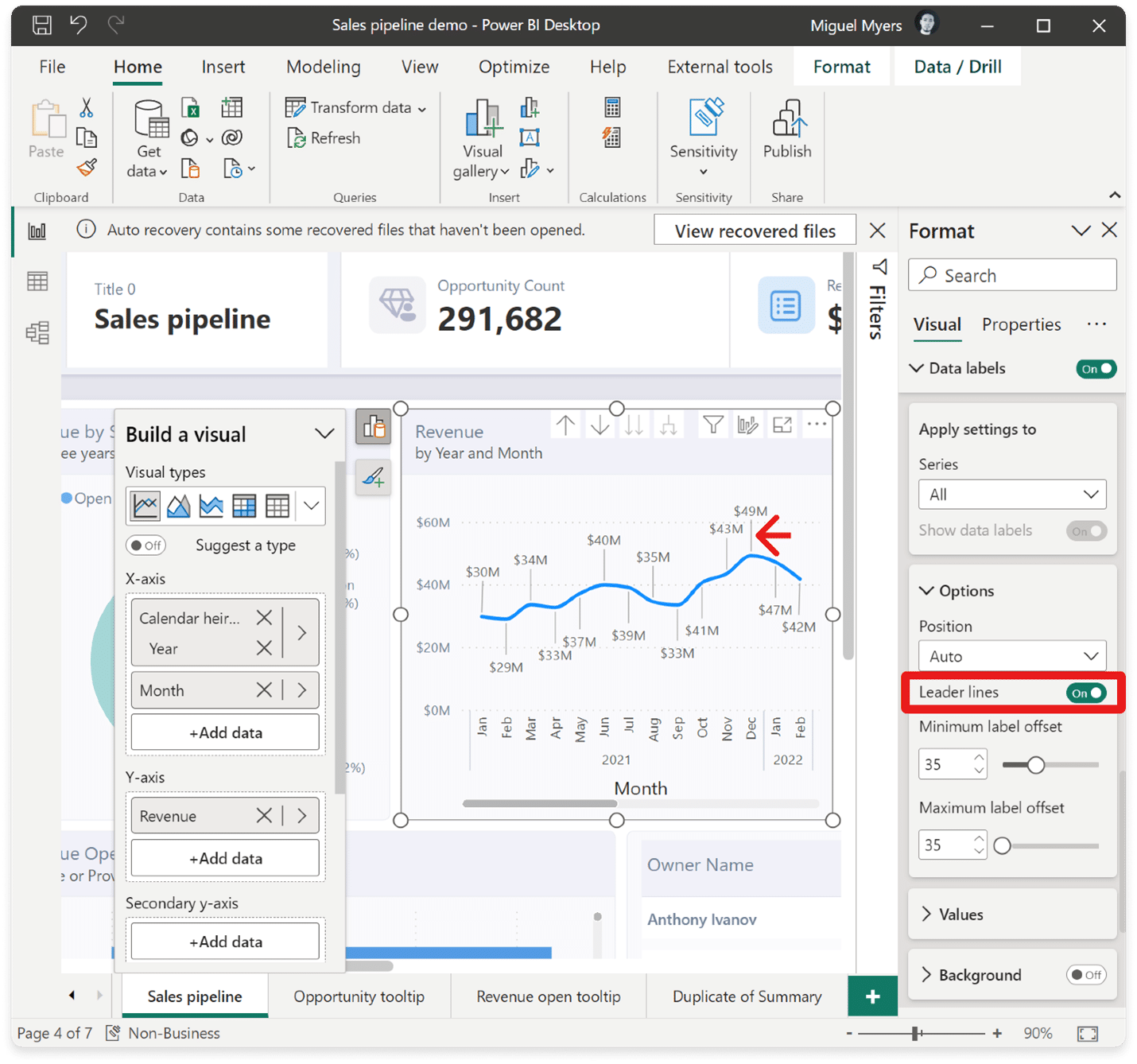
Leader lines for both line and area charts have been added. This new feature creates a visual connection between each data point and its corresponding label. To access this feature, simply navigate to the Data labels > Options > Leader lines.
On-Object Interaction (Preview)
The new on-object interaction feature released to preview back in March. This month there are more improvements and bug fixes.
Customize the Pane Switcher
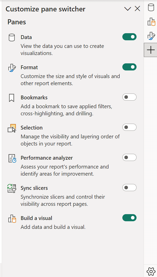
Now, you will find a new ” +” button directly on the pane switcher, allowing you to quickly add new panes without navigating to the View ribbon. Furthermore, this menu provides a helpful overview of available panes and their functions, streamlining your navigation experience.
Even more impressively, the panes you add to the switcher will be saved across reports. Say goodbye to repetitive configurations; set it up once, and you’re all set!
You can also access the 2 preference settings released last month for “always show the pane switcher” and re-attaching the build menu as a pane by using the gear icon.
CTRL click to open multiple panes in the Pane Switcher
In addition to the right-click option “open in new pane,” you can now open multiple panes effortlessly by holding down the CTRL key and clicking on the panes you want to open. This time-saving feature streamlines your workflow, allowing you to quickly access the specific panes you need with a simple keyboard shortcut.
Treemap
Noteworthy bug fixes
- Overlap of the on-object buttons on the formula bar has been resolved.
- Visual tooltip showing automatically when opening the build menu, blocking the formatting on-object button is now fixed.
- Selected visual type is now reflected in the ribbon visual gallery accordingly.
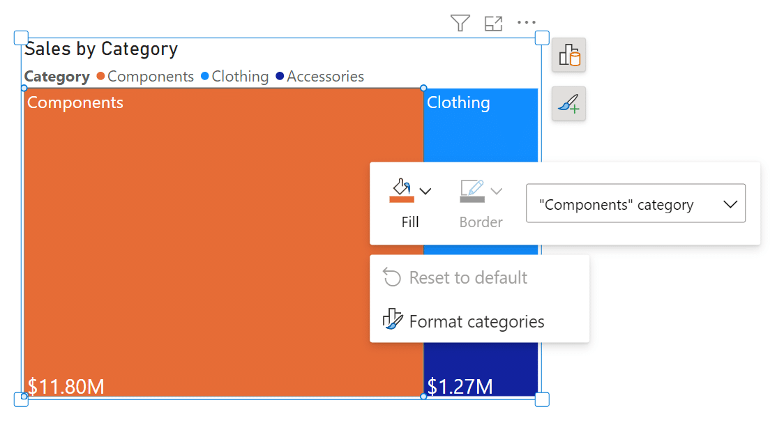
- Mini-toolbar’s fill color icon now reflects conditional formatting gradient as well.
Modeling
Edit your data model in the Power BI Service
Relationship validation
Power BI is introducing relationship validation in the Service, simplifying the process of creating and editing relationships directly on the web platform. Similar to Power BI Desktop, as you define the properties of your relationship, the system will automatically validate it, ensuring accuracy and efficiency. Additionally, you’ll receive appropriate choices for cardinality and cross-filter selections, making relationship management a seamless and user-friendly experience.
Data Connectivity
Snowflake (Connector Update)
The Snowflake connector has been updated to include various performance improvements, such as usage of SQLBindCol. Users should experience better performance when running queries.
Google Analytics (Connector Update)
The Google Analytics connector has been updated to support Google Analytics Data API (Google Analytics 4). To use this new functionality, use “Implementation 2.0” when connecting. Existing connections will not be affected.
Azure Databricks, Databricks (Connector Update)
The Azure Databricks and Databricks connectors have been updated. Please find notes from the Databricks team below.
- Add a new DSRHandler to databricks-multicloud
- Fix UC_NOT_ENABLED and Catalog ‘spark’ not found error in legacy code path using Databricks.Contents
Denodo (Connector Update)
The Denodo connector has been updated. Please find notes from the Denodo team below.
- This new version adds graphical support for the specification of native SQL queries at data source creation time.
EQuIS (Connector Update)
The EQuIS connector has been updated. Please find notes from the EQuIS team below.
- Remove “Beta” attribute
- Retrieve report content as .csv to remove the row limitation of .xlsx files
- Optimize handling of facility groups in navigation tree
- Show report and/or location folders in navigation tree even if one or the other is empty
Anaplan (Connector Update)
The Anaplan connector has been updated.
- This version of Power BI connector for Anaplan includes backend changes for compatibility with ongoing Anaplan infrastructure updates. There is no change to user facing connector features.
Service
Dataset details page revamp
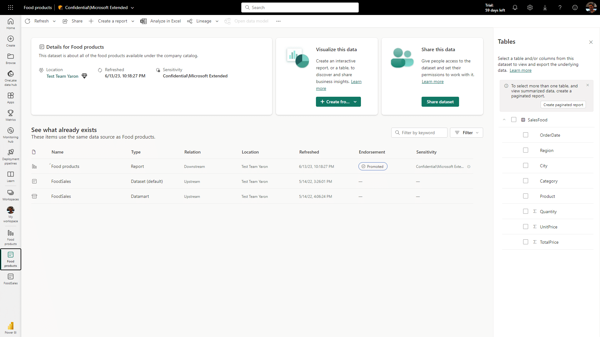
When you click on a dataset item in the OneLake data hub and workspace view, you’ll be directed to this redesigned page, offering a more intuitive and informative interface.
Here’s what you can look forward to on the dataset details page:
- Actions: Access various actions to interact with the dataset, including creating a report and refreshing the dataset. Additionally, we’ve introduced a new feature that allows you to view the refresh history under the refresh menu.
- Dataset Metadata: Gain valuable insights into the dataset, including its description and last refresh time.
- Related Items: Explore and navigate through related items associated with the dataset.
- Dataset Schema: Get a comprehensive view of the dataset’s tables and columns. Clicking on a table provides a preview, and you can even export the data using paginated reports behind the scenes.
In addition, the related items list has been improved, now showcasing all downstream and upstream dependencies for the dataset. This enhancement allows you to effortlessly identify the sources of the dataset, composite model relations, reports, and dashboards associated with it.
Mobile
Datasets in Power BI Mobile apps
In the upcoming release, w a highly requested feature that allows dataset owners and report creators to manage their datasets directly from their mobile devices will be introduced.
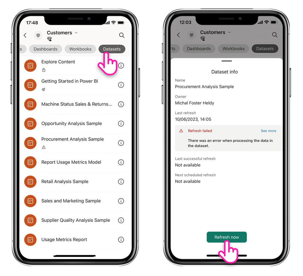
With this new functionality, you can easily access the datasets available in your workspaces. Simply go to the workspace, select the “dataset” pill at the top, and you’ll see a list of datasets accessible within that workspace.
Tapping on a dataset will bring up the dataset metadata pane, providing essential information such as the name, owner, sensitivity label, and the latest refresh status. Moreover, you’ll have the convenience of triggering a dataset refresh directly from your mobile app!
For dataset owners, Power BI added push notifications to alert you when a schedule refresh fails. You can view the failure details and even re-try the refresh while on-the-go. Stay informed and in control of your datasets, all from the convenience of your mobile device.
With these exciting updates, managing datasets on Power BI Mobile has never been easier and more efficient.
Visualizations
New visuals in AppSource
The following are new visuals for this update:
- Spider Chart for Power BI by VisioChart
- HTML Content (lite)
- Stacked Lipstick Bar Chart (Standard)
- Stacked Lipstick Column Chart (Standard)
- 100% Stacked Column Chart with Values instead of % (Standard)
- Dual Axis Scatter Chart (Standard)
- Category Comparison Bar Chart
- Stacked Column with Percentage and Total in Label (Standard)
- Likert Scale Chart for Power BI by ChartExpo
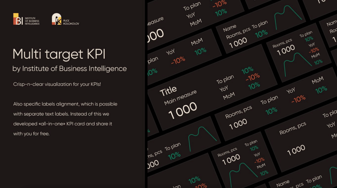
An “all-in-one” Multi Target KPI card
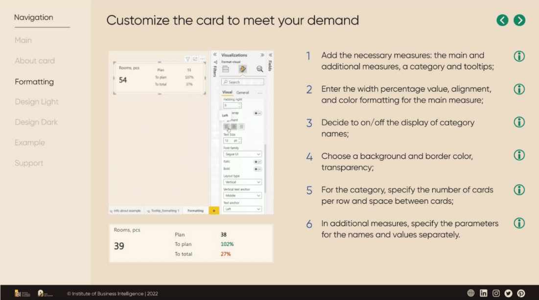
Introducing the Multi Target KPI card, a powerful visual that revolutionizes reporting! With just a single query, you can now benefit from three additional indicators, multiple categories, and a pixel-perfect alignment setting. Built-in conditional formatting further enhances the visual’s flexibility and customization options.
With easy-to-use settings for layout type and color conditional formatting, even non-designers can quickly make impactful changes. Simply select the desired measure and category, if needed, and add up to three additional indicators to provide the perfect context for your metrics.
Other
WebView2 GA
WebView2 is now generally available!


