In the ever-evolving world of business intelligence, staying up-to-date with the latest tools and advancements is crucial for organizations aiming to gain a competitive edge. Microsoft Power BI, a leading data visualization and analytics platform, continues to impress with its regular updates, delivering enhanced features and capabilities to help businesses harness the full potential of their data. In this blog post, we’ll dive into the exciting June updates introduced by Microsoft Power BI.
Reporting
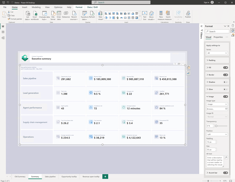
New card visual
The new card visual comes with special surprises that include:
- Customize the shape corners to achieve your desired style.
- Refined formatting settings for values and labels, with expanded support for conditional formatting and the introduction of font transparency.
- Customize your display units with precision control, thanks to the new custom option and ensure your cards display the proper content, even when no data is found, with the new ‘Show blank as‘ feature.
- Choose from three layouts (Horizontal, vertical, and grid) and fine-tune your cards by adjusting the padding, spacing, and text alignment.
- Bring your data to life with interactivity features like tooltips and drill through.
- ‘Themes’ allows you to control all formatting settings to personalize your default styles.
OneLake data hub in Power BI Desktop
In a significant development, the data hub in Power BI Desktop has undergone a rebranding and is now known as the “OneLake data hub,” as part of the recent Fabric release. This exciting update brings a host of new possibilities for discovering and reusing data within Power BI.
The OneLake Data Hub in Power BI Desktop serves as a centralized location for data exploration and reuse. It enables users to leverage existing Fabric items and create their own datasets and reports on top of them. The hub offers support for a range of items, including data warehouses, lakehouses, their associated SQL endpoints, datamarts, and datasets (with the upcoming addition of KQL databases later this year).
When working with lakehouses, SQL endpoints, datamarts, and warehouses, the OneLake Data Hub provides two options for data retrieval:
- Connect to the auto-generated dataset: Users can seamlessly connect to the underlying auto-generated dataset, enabling quick and easy access to the data for analysis and reporting purposes.
- Connect directly to the SQL endpoint: For more advanced users and specific requirements, the OneLake Data Hub allows direct connectivity to the SQL endpoint, facilitating the creation of customized datasets tailored to unique business needs.
On-Object Interaction – Updates
Now users can attach the build menu to the pane switcher by 1 of 3 ways:
- Directly from the on-object button;
- From the View ribbon;
- From the options menu.
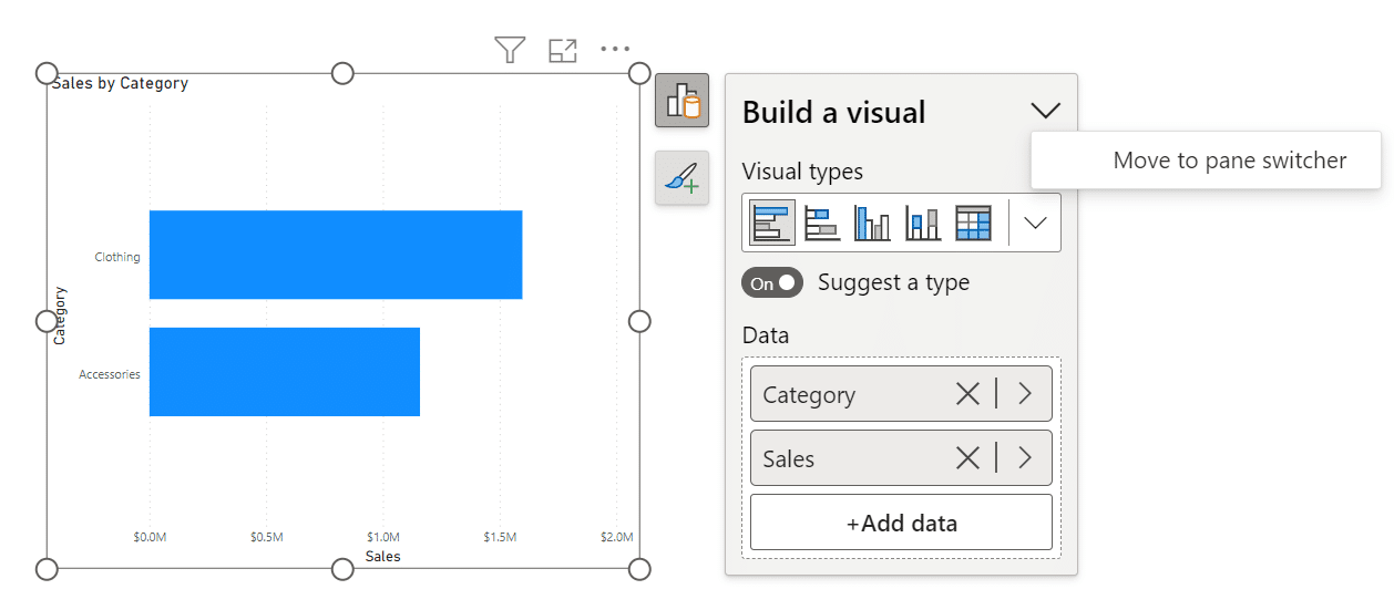
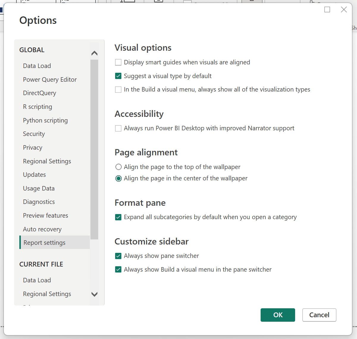

In addition to the ability to re-attach the build menu, a new setting has been introduced to allow users to choose to have the pane switcher always visible. These two new settings will persist across reports, providing a personalized experience. Excitingly, next month we have more customization options coming for the pane switcher. Keep an eye out for two new features: a convenient “add” button on the pane switcher, allowing quick addition of new panes without navigating to the ribbon, and the ability to save these newly added panes across reports.
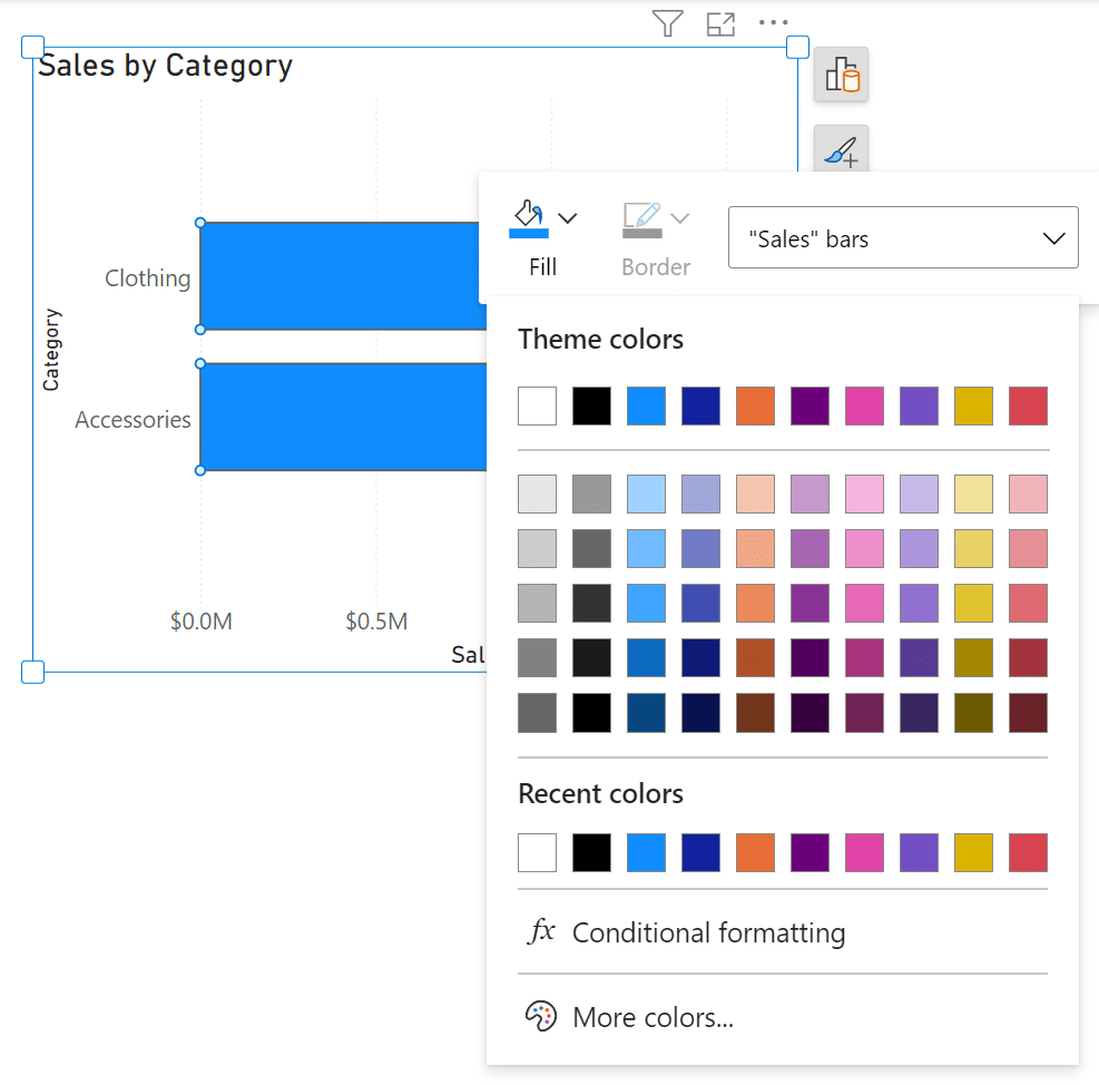
Furthermore, this month brings the capability to set and edit conditional formatting directly from the on-object mini toolbars. This enhancement streamlines the process of applying conditional formatting, making it more efficient and user-friendly.
Data connectivity and preparation
Introducing Visual Cue for New Tenant Settings
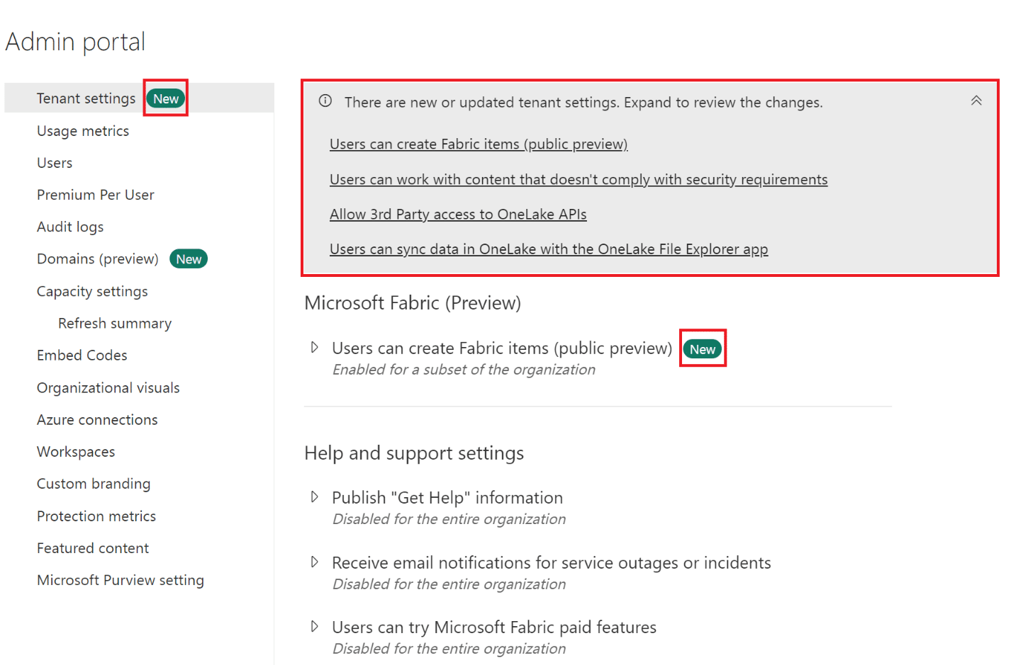
An exciting new feature has been introduced for tenant admins, bringing enhanced functionality to the admin portal. With the implementation of visual cues, admins can effortlessly identify and manage new settings within their Power BI environment.
Within the admin portal’s tenant settings page, changes are now accompanied by a distinctive icon, allowing admins to quickly spot new settings. Additionally, a convenient summary of all new settings is provided at the top of the page, offering direct links to the corresponding settings. This feature greatly facilitates navigation and enables efficient management of tenant-level controls. By utilizing Visual Cue, admins can stay informed and maintain complete control over their Power BI tenant settings.
Introducing the Tenant Admin Settings API
Introducing the Tenant Admin Settings API, a powerful tool that empowers developers to seamlessly read tenant admin settings within Power BI. This API provides effortless retrieval and access to a comprehensive array of administrative settings through a single API endpoint. Gain convenient access to all the necessary tenant-level admin settings, including on/off status, security group configuration, and more. By leveraging the Tenant Admin Settings API, developers can unlock exciting possibilities for automating tenant setting audits. Streamline your processes and take full advantage of this API to enhance administrative efficiency and control within Power BI.
Service
Storytelling in PowerPoint – Embed visuals from Power BI organizational apps
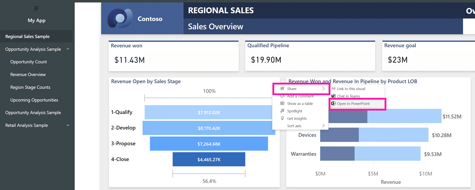
Embedding visuals from organizational apps into your PowerPoint presentation is now easier than ever. Simply obtain the link to the visual you wish to embed and follow these simple steps. Start by opening your organizational app and locating the desired visual. Next, access the visual’s More options (…) menu and select the Share option. From there, choose either “Link to this visual” or “Open in PowerPoint.” Copy the link that is generated and paste it into the add-in within your presentation. With these straightforward instructions, you can seamlessly incorporate visuals from your organizational apps into your PowerPoint slides.
Edit your data model in the Power BI Service – Updates
The data model editing feature in the Power BI Service, which was released for preview in April, has undergone significant improvements. Here are the latest enhancements introduced this month:
Improved Layouts Limitations: Modifications made to layouts in the Power BI Service will now be saved for future sessions. This includes:
- Creation or deletion of custom layouts within the Service. The corresponding names and tables added/removed to these layouts will also be saved.
- Visual alterations made within a layout, such as adjusting the size and position of cards, expanding or collapsing all fields in a card, and pinning fields to the top of a card.
It’s important to note that layout changes made exclusively within the Power BI Service will be saved within the Service itself. However, there is a current limitation where uploading a .PBIX file to the Service will not include any existing layout changes, including custom layouts created in Power BI Desktop. Similarly, when downloading the .PBIX file, any layout changes made in the Service, including custom layouts, will not be reflected in Power BI Desktop.
Introducing a new admin setting to control email subscriptions for B2B guest users
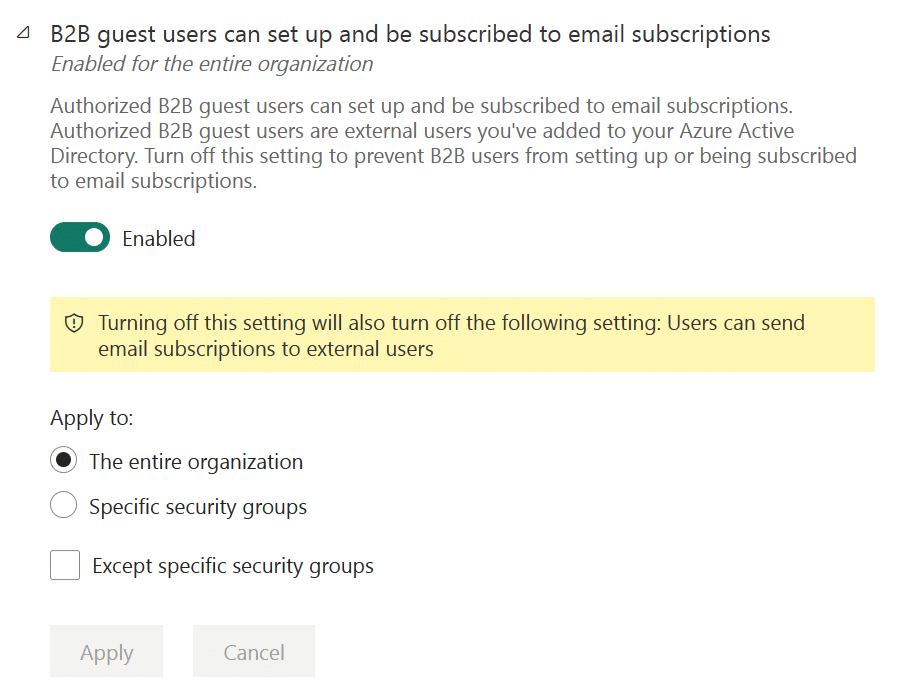
As a tenant admin, you now have enhanced control over email subscriptions specifically for B2B guest users. By enabling the new “B2B guest users can set up and be subscribed to email subscriptions” setting, you grant B2B guest users the ability to create their own email subscriptions. Additionally, users within your organization can include B2B users as recipients of email subscriptions.
On the other hand, if you choose to disable this setting, only users within your organization will have the privilege to set up and be subscribed to email subscriptions.
This new setting provides flexibility in scenarios where you want B2B guest users to access content in the Power BI service but restrict their ability to distribute content using email subscriptions. It empowers you to achieve a fine-grained control over the email subscription functionality. For detailed information and instructions, refer to the documentation.
Upon release, the default state of this setting will align with the general setting for email subscriptions, which is “Users can set up email subscriptions.”
Admin Monitoring
As organizations increasingly prioritize governance, compliance, and policy management, it becomes essential to have enhanced visibility into related workflows. Introducing the Admin Monitoring Workspace, a powerful solution that offers curated insights to effectively manage, administer, and govern your tenant.
In its Public Preview release, the Admin Monitoring Workspace provides the Feature Usage and Adoption dataset and report. These valuable resources equip tenant admins with insights derived from inventory metadata and audit logs, enabling them to:
- Gain a clear understanding of user activities and actions within the tenant
- Track tenant usage and monitor adoption growth
- Support auditing processes and ensure compliance with organizational policies
By default, the Admin Monitoring Workspace is accessible exclusively to Tenant Admins. However, they have the option to share the workspace or specific reports within it with other members of their organization. For more information on sharing reports, please refer to this resource, and to understand the existing roles and permissions, consult this guide.
How can the Out-of-Box report/dataset help you succeed?
- The Feature Usage and Adoption report offers insightful analytical views based on Audit Logs, empowering you to gain a deeper understanding of user activities within Power BI. By identifying trends, patterns, and specific actions, you can effectively govern Power BI and address any concerns. For instance, if you discourage direct report sharing from personal workspaces, this report provides visibility into such occurrences.
- The Feature Usage and Adoption dataset combines tenant metadata dimensions of various Power BI items with Audit Log fact data related to asset lifecycle activities (such as creation, access, modification, and deletion). To provide easy access to the audit data, we offer a subset of the Audit Log data directly within the dataset, eliminating the need for Microsoft 365 admin rights.
- Furthermore, the out-of-the-box dataset supports Power BI’s native capability for composite data modeling. This means you can enhance the dataset by incorporating additional data such as user licensing information, data lineage data, or region-specific metadata. This flexibility allows for customized reporting that aligns with your organization’s unique scenarios and requirements.
Embedded
Get started with Power BI embedded in minutes
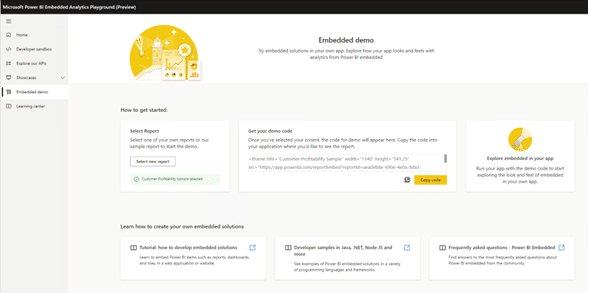
The Power BI embedded playground now includes a new demo experience that simplifies the process of exploring how to embed Power BI in your application. This demo provides a convenient way to generate code snippets that you can easily copy and paste, allowing you to preview how a report will appear within your app. Even if you haven’t created your own reports yet, you can generate demo code for our sample report, giving you a glimpse of how it would integrate into your application.
Once you’re satisfied with the embedded content and ready to proceed, you can select the solution that best suits your requirements. Follow the relevant tutorial provided to create the necessary code to implement the selected solution. Additionally, our Client APIs are available to enhance the interactions between the embedded report and your application. You can tailor the appearance and functionality of the report to seamlessly align with your app’s look and feel. To explore and interact with these APIs, you can utilize our dedicated “Explore our APIs” or “Developer Sandbox” pages.
Create Power BI reports instantly in Jupyter Notebooks
With the recent update to the powerbi-jupyter Python library, you now have the capability to create new Power BI reports seamlessly within your notebook using data directly from the notebook itself. This powerful feature eliminates the need for switching between different tools or exporting data from the notebook, allowing you to instantly gain insights and analyze your data within a unified environment.
This update complements the existing functionality of embedding Power BI reports in Jupyter notebooks. Now, not only can you embed Power BI reports, but you can also leverage the library to generate new reports using your notebook data. This empowers you to enhance your notebooks with your existing Power BI content, enabling you to construct engaging and informative data narratives.
The report generated using the newly created feature will be automatically generated based on the input DataFrame’s data. This report offers customization and modification options, allowing you to tailor it according to your specific requirements. Once customized, you have the option to save the report to Power BI, ensuring its preservation and enabling easy sharing with colleagues within your organization.
This auto-generated report serves as a valuable tool for data exploration. Additionally, it can be utilized as a starting point for building your own custom report, providing a foundation to build upon and further refine according to your unique needs.

Developers
Power BI Desktop Developer Mode
Power BI customers have a growing need for scalable enterprise BI solutions that cater to all users within large organizations. To address this, Power BI has introduced the public preview of Power BI Desktop Developer Mode, which brings enterprise-level BI development experiences directly into Power BI Desktop, leveraging Microsoft’s extensive expertise in this field.
With Power BI Desktop Developer Mode, you now have a new and efficient approach to author, collaborate, and save your projects. By saving your work as a Power BI Project (PBIP), report and dataset definitions are stored as individual plain text files within a user-friendly folder structure, facilitating source control integration.
As a developer, you can leverage this integration to:
- Utilize Power BI Desktop to author report and dataset metadata files in formats compatible with source control systems.
- Enable seamless collaboration among multiple developers, incorporating source control features to track version history, compare different revisions, and revert to previous versions.
- Build robust continuous integration and continuous delivery (CI/CD) workflows, enforcing quality gates before deploying to production environments.
- Facilitate code reviews, automated testing, and automated builds to ensure the integrity of your deployments.
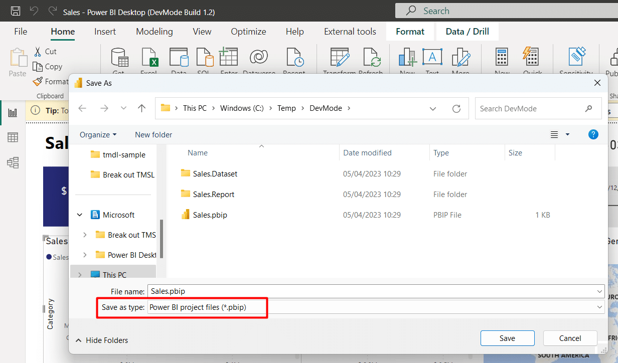
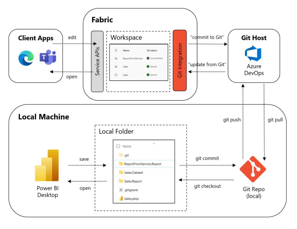
By combining Power BI Desktop Developer Mode, Fabric Git Integration, Azure DevOps, and Deployment Pipelines, developers now have the seamless capability to synchronize their Power BI workspaces with Git repositories. This integration not only ensures consistency but also facilitates continuous integration and continuous deployment (CI/CD) workflows, enabling a smooth and efficient development process.
Visualizations
New visuals in AppSource
The following are new visuals for this update:
Create the most interactive waterfall charts
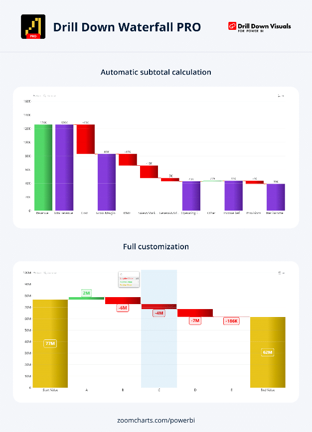
With Drill Down Waterfall PRO by ZoomCharts, you can create visually stunning charts like never before, offering complete control over the appearance of your chart. This powerful tool includes a range of features, including:
- Sub-totals: You have the flexibility to set display values in your dataset or rely on the visual to automatically calculate them, saving you time and effort.
- Extensive customization options: Tailor the increasing, decreasing, and totals series to your liking with options for colors, outlines, column widths, column connectors, value labels, and more.
- Static and dynamic thresholds: Clearly demonstrate targets by incorporating up to 4 thresholds, providing a visual representation of your data.
- Touch device compatibility: Easily explore data using both mouse and touch input devices, ensuring a seamless user experience.
The Drill Down Waterfall PRO visual is commonly utilized in various domains, including:
- Accounting and finance: Perfect for creating profit and loss statements.
- Inventory management: Gain insights into opening stock, stock movement, and closing stock.
- Human resources: Track changes in staff numbers over time.
ZoomCharts Drill Down Visuals are highly regarded for their interactive drilldown capabilities, smooth animations, and robust customization options. They support various interactions, offer customizable and native tooltips, enable filtering, and allow for the creation of bookmarks to enhance your data exploration and analysis.
PowerGantt Chart by Nova Silva
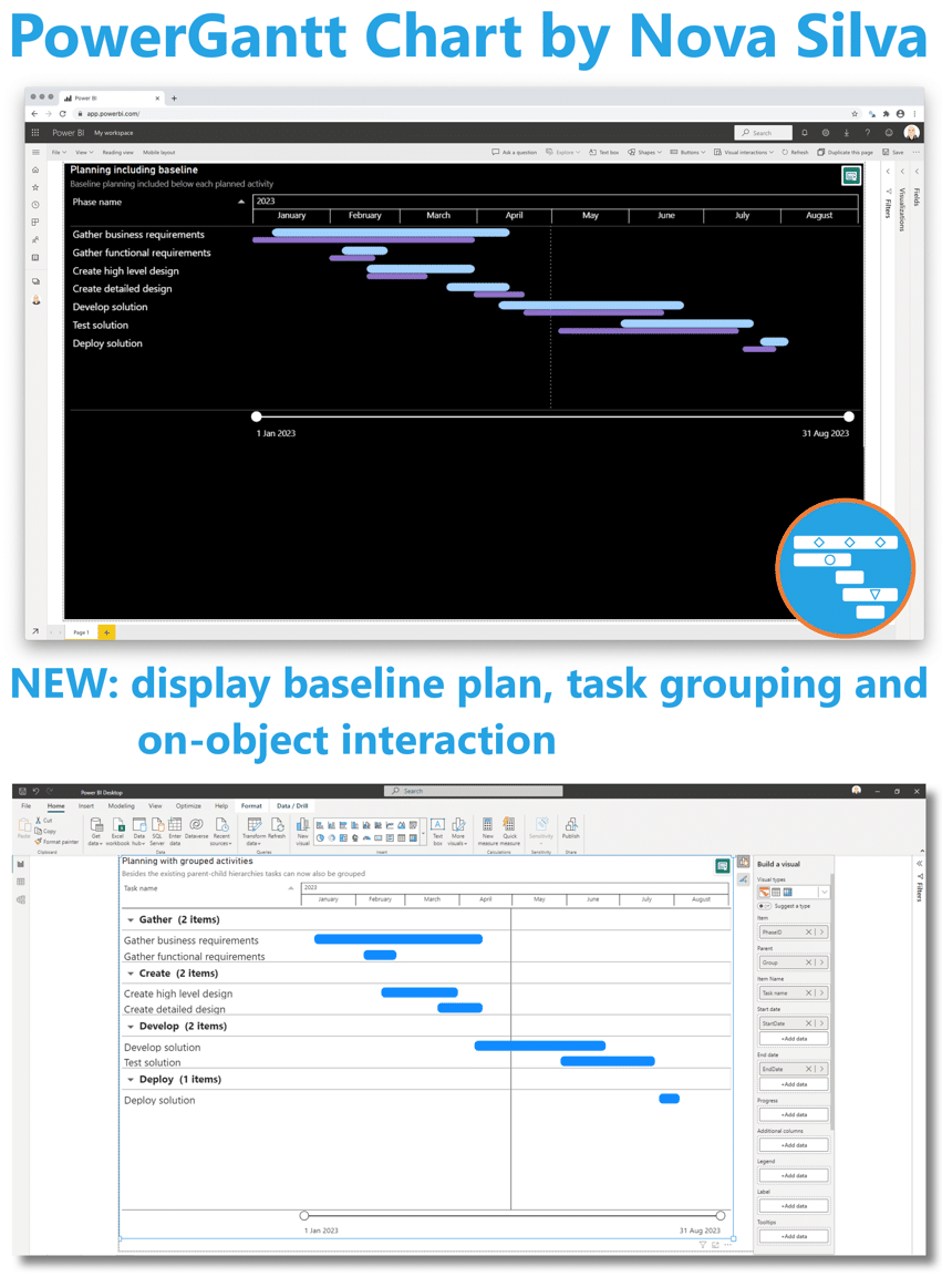
The latest update to PowerGantt Chart introduces a highly anticipated feature – baseline planning. Now, you can include a baseline planning element in your chart, represented by a thinner bar positioned below the main task bar. In the accompanying image, the purple bar signifies the baseline planning.
Furthermore, PowerGantt Chart expands its capabilities beyond supporting parent-child hierarchies. You can now group tasks based on any categorical variable, providing even more flexibility in organizing and visualizing your data.
In addition to the enhancements specific to PowerGantt Chart, several exciting new features have been introduced across all Power BI visuals. These include on-object interaction, allowing users to interact directly with the visual elements, as well as the option to include subtitles and dividers, enhancing the overall presentation and clarity of your reports.
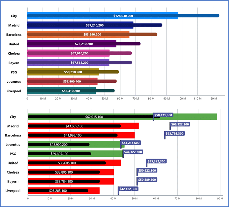
Advanced Linear Gauge by MAQ Software
newest Power BI custom visual: the Advanced Linear Gauge by MAQ Software.
In any industry, it is typical to establish goals before pursuing them. With this visual, you can monitor progress towards target values and conduct detailed analysis with the visual’s suite of basic and premium functionalities.
Key business uses:
- Financial services: Track budget consumption against allocated budgets for the year or quarter.
- Sales: Track daily or weekly progress against sales goals for the year or quarter.
- Marketing: Track progress on impressions, views, and clickthrough against the marketing campaign targets.
- Operations: Track daily output against daily or weekly goals.
Key features:
- Customizable bars
- Customizable axis labels, colors, fonts, etc.
- Customizable labels for the data points
- Ability to designate 1 set of values (5 in Premium) as the target for the categories
- Tooltips to display additional information
- Ability to plot an inner Comparison bar (Premium)
- Color rules – automatically change the color of bars based on specified thresholds (Premium)
- Connector lines – lines to align multiple targets within a single bar (Premium)
- Customizable display ratio – change the display ratio of the bars and axis labels (Premium)
